— Branding, packaging design
Tasked with evolving the Martinborough Vineyard brand and identity.
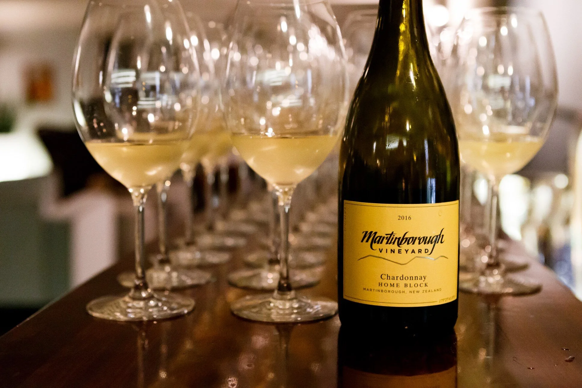
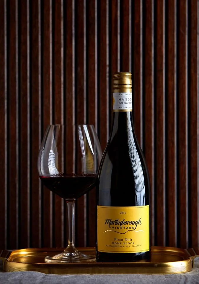
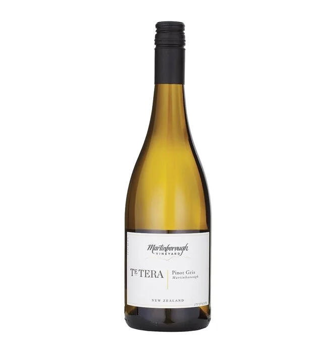
The updated mark refines their existing calligraphic script and introduces an accompanying mark, inspired by the mountainous surrounding regions.
The labels themselves hero both MV’s iconic yellow and the region’s celebrated location. Before vines were laid, Martinborough was identified as being the closest match to Burgundy in the Southern Hemisphere.